Tuesday, 25 June 2013
Tuesday, 11 June 2013
Tuesday, 21 May 2013
Wednesday, 24 April 2013
Tuesday, 23 April 2013
Film Poster Planning Sheet
I chose the colours because:
I will use one of these three images in my final poster. I like the lighting in all three of these images and the facial expressions are exactly what I want my character to look like.


My favourite is the last one because I could put a bright line down her back to bring attention from the top of the poster to the bottom. This will create a Z shape.
- the dark colour bring attention to the title.
- the blue glittery background gives the sense of magic or supernatural.
- the well lit face and dark hair/neck tells the audience she is hiding.
- the grey text is pointed out by the bright line by the side of the woman's face.
- the grey text explains the character, you get a preview of her super abilities.
I will use one of these three images in my final poster. I like the lighting in all three of these images and the facial expressions are exactly what I want my character to look like.


My favourite is the last one because I could put a bright line down her back to bring attention from the top of the poster to the bottom. This will create a Z shape.
Wednesday, 17 April 2013
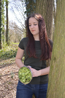
Photography 16/04/13 and 23/04/13 (different lighting)
+edited+.jpg) |
| Week 1 |
+edited+.jpg) |
| Week 1 |
+edited+.jpg) |
| Week 1 |
+edited+.jpg) |
| Week 1 |
+edited+.jpg) |
| Week 1 |
+edited.jpg) |
| Week 2 |
+edited.jpg) |
| Week 2 |
+edited.jpg) |
| Week 2 |
+edited.jpg) |
| Week 2 |
+edited.jpg) |
| Week 2 |
+edited.jpg) |
| Week 2 |
Tuesday, 16 April 2013
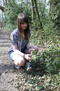
Goffs Park Pictures 14/03/13 Mirror Photography
Wednesday, 13 February 2013
Subscribe to:
Comments (Atom)
.JPG)
.JPG)
.JPG)
.JPG)
.JPG)
.JPG)
.JPG)
.JPG)


