Tuesday, 23 April 2013

Film Poster Planning Sheet

I chose the colours because:
  •  the dark colour bring attention to the title.
  • the blue glittery background gives the sense of magic or supernatural.
  • the well lit face and dark hair/neck tells the audience she is hiding.
  • the grey text is pointed out by the bright line by the side of the woman's face.
  • the grey text explains the character, you get a preview of her super abilities. 
I chose to use this poster as inspiration to mine because the film is inspiration for my film and the female character in the poster is most similar to mine.


I will use one of these three images in my final poster. I like the lighting in all three of these images and the facial expressions are exactly what I want my character to look like.


 My favourite is the last one because I could put a bright line down her back to bring attention from the top of the poster to the bottom. This will create a Z shape.

Wednesday, 17 April 2013

Photography 16/04/13 and 23/04/13 (different lighting)

Week 1

Week 1

Week 1

Week 1

Week 1
Week 2 
Week 2 
Week 2 
Week 2 
Week 2 
Week 2
The difference between week 1 and week 2's images are that week 1's images are brighter because we used flash lights however we had to get the timing right to get a good image. The 2nd week's images are not as bright however we could take one image per second by holding down the capture button, this means we could take more pictures and get better quality.

Tuesday, 16 April 2013

Goffs Park Pictures 14/03/13 Mirror Photography


Taken by Hayley Wilson
 These last two images were taken by my Friend Hayley Wilson. It inspired me to use a mirror's reflection, like the images above.
Taken by Hayley Wilson

Wednesday, 13 February 2013

Crawley Futures


Before
After


Before
After

Before
After

Tuesday, 11 December 2012

Tuesday, 4 December 2012

Retouch and Healing Tools

Before


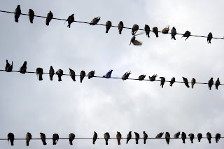
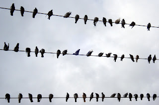
From these two images of birds, yo can see that I have edited out the flying bird in the top right using the "J" to open the "Spot Healing Brush Tool". I then had to fill in the bird to create a blurred image of the background creating the illusion of a bird that has gone.


After

I also removed a bird by:
clicking "J" then clicked on the "Patch tool"
I then drew round the bird (middle line on the lift) and dragged the shap to a gap in the top line so their would be a line not a gap.
This got rid of the bird and replaced it with the line.
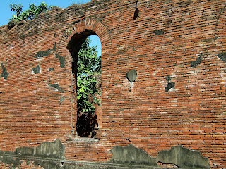


Before


As you cn see in image 1, their are a lot of nasty grey patches. I wanted to get rid of thee grey patches to create a nice wall.

Using the keyboard I clicked the "J" button wih automatically took me onto the "Spot Healing Brush Tool" which I used to get rid of the gaps.
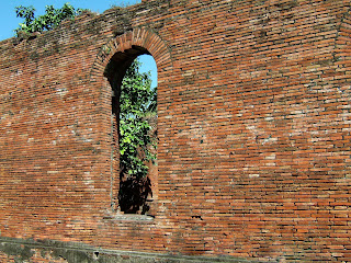
After

I filled in the gaps which pasted the brick background in its place and was quicker than drawing round the grey space and lining up the bricks using the "Patch Tool"

Wednesday, 28 November 2012

Tuesday, 27 November 2012

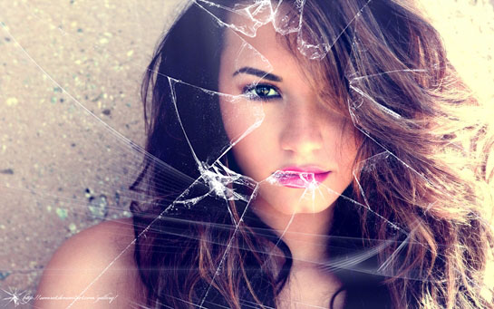
Photoshop- Broken Glass


(Clicked on button that said "normal" and change it to "screen" to make the black cracked glass see-through)

(Top image: Made the glass bigger than the image then rotated and adapted the size of the glass to get the best cracked glass withut any wholes)

(

Wednesday, 21 November 2012

Photoshop Alan Sugar in sugar and elephant mouse


  • First I saved a picture of sugar and Sir sugar.
  • I opened both pictures in Photoshop.
  • I Clicked the L key to create a lasso to just get Sir Sugard head.
  • I clicked Q to see if I had selected all of his head. If not click erase and go over selecting all features.
  • CTRL J to make a layer. I had to move the layer to the photo of the sugar. Move tool, drag layer to picture of sugar.
  • I clicked CTRL T to edit the size of Sir Sugars head.
  • Then I saved file as a jpg once right clicking on the layer of Sir Sugar and selecting duplicate to add more heads.